
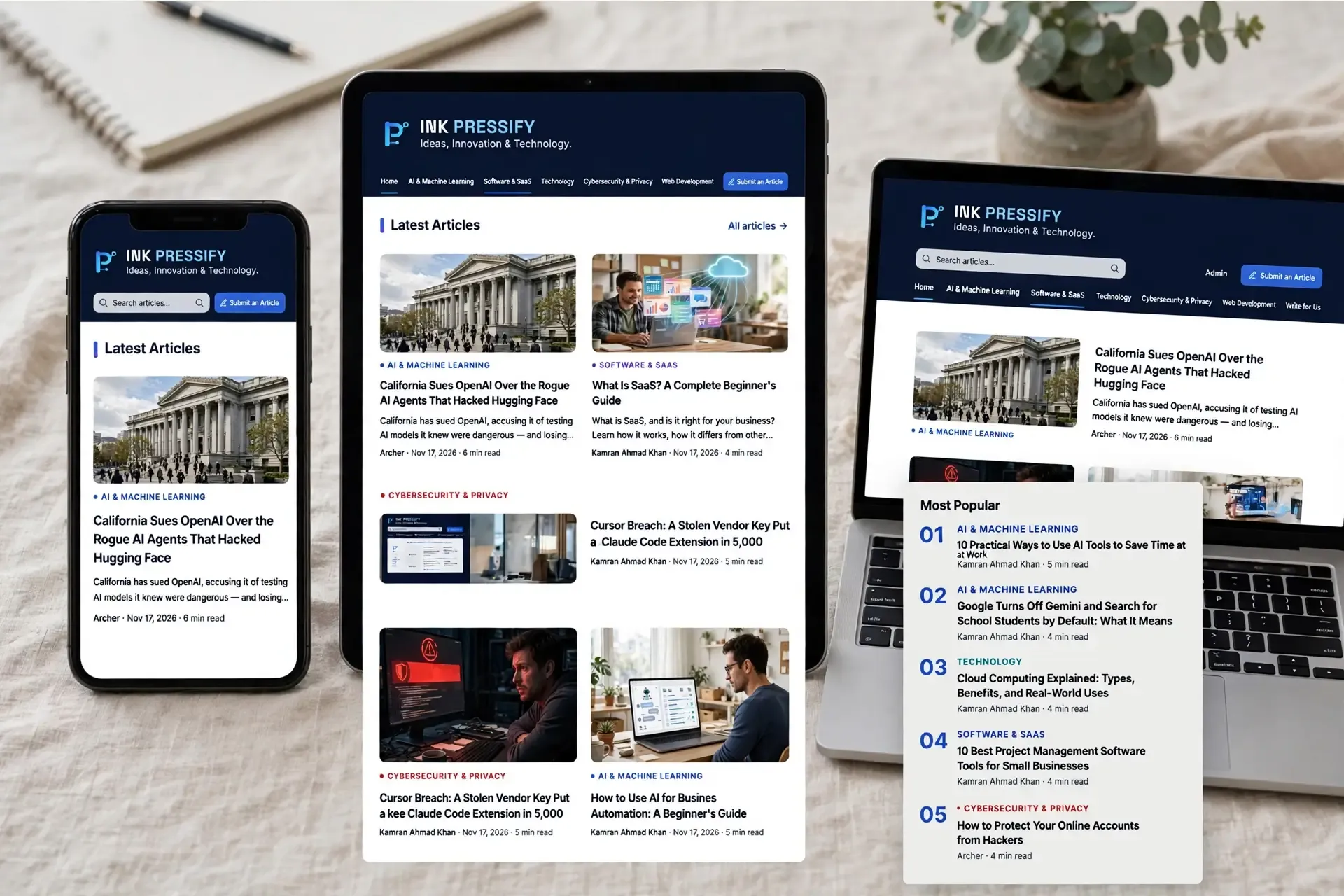
Responsive web design is a way of building a website so that one page adapts to fit any screen, from a small phone to a large monitor. It matters because people visit from many kinds of devices, and a site that's hard to use on any of them can lose visitors, sales, and search visibility.
web.dev describes it as changing a site's layout to suit the device being used. For example, a page might show one column on a phone, two on a tablet, and three or four on a desktop computer. Web designer Ethan Marcotte introduced the term in A List Apart in May 2010.
All visitors get the same page at the same web address. The layout changes, but they aren't sent to a separate mobile site.
How responsive web design works

The viewport setting
This line in a page's HTML tells the browser to match the page to the width of the screen:
<meta name="viewport" content="width=device-width, initial-scale=1">Without it, mobile browsers usually render the page at a desktop width, often around 980px, which can leave text small and force people to zoom.
Flexible layouts
Instead of fixing every section at an exact pixel width, modern layouts use tools such as CSS Grid and Flexbox, so content can resize and wrap to fit the available space.
.cards {
  display: grid;
  grid-template-columns: repeat(auto-fit, minmax(250px, 1fr));
  gap: 1rem;
}
This creates as many columns as will comfortably fit, without any special rules for particular devices.
Media queries
Media queries apply CSS only when certain conditions are met, such as a minimum screen width. The point where the layout changes is called a breakpoint.
@media (min-width: 768px) {
  .page {
    display: grid;
    grid-template-columns: 1fr 3fr;
  }
}
They can also check how someone is interacting with the page, including whether their device can hover over elements.
Flexible images
A simple CSS rule stops an image from overflowing its container:
img {
  max-width: 100%;
  height: auto;
}
web.dev also recommends adding width and height attributes to images so the browser can reserve space and avoid layout shifts. You can also use srcset and sizes to serve smaller image files to smaller screens.
Container queries
Media queries respond to the size of the screen. Container queries respond to the space around a component, so the same card can look different in a wide main column and a narrow sidebar.
Responsive vs adaptive vs separate mobile sites
Approach | How it works | Main trade-off |
|---|---|---|
Responsive | One page and URL, with CSS adjusting the layout | Needs careful planning and testing |
Adaptive or dynamic serving | The server sends different versions to different devices | More versions to build and keep working |
Separate mobile site | A different URL, such as | Two sites to maintain |
Why responsive web design matters
Your visitors use different devices
You can't predict what screen someone will use. StatCounter's worldwide figures for September 2026 showed about 59% of web traffic on mobile, 39% on desktop, and 2% on tablets. Your own audience may be different, so check your analytics, but neither phones nor desktops can be ignored.
It gives people a better experience
People expect to scroll vertically, not horizontally. Making them zoom or scroll sideways makes a page harder to read and use, especially when they're trying to fill in a form or complete a purchase.
It supports your SEO
Google uses the mobile version of a site's content for indexing and ranking. It also recommends responsive design as the easiest pattern to implement and maintain.
Responsive design doesn't guarantee better rankings, but it helps you avoid mobile problems and keeps your content consistent across devices.
It improves accessibility
Responsive layouts also help people who zoom in to read. The W3C's WCAG Reflow criterion asks that most vertically scrolling content works at a width equivalent to 320 CSS pixels without scrolling in two directions. That's the same as a 1280-pixel-wide window at 400% zoom. The W3C says responsive design is the most effective way to achieve this.
It's easier to maintain
With one set of pages, you update your content in one place. You also avoid building a new layout for every device, and a flexible design is better prepared for screen sizes that don't exist yet.
Best practices
Start with small screens. web.dev suggests designing for a small screen first, then widening it until the layout needs a breakpoint.
Set breakpoints around your content. Add one where the design starts to look wrong rather than targeting specific phone models.
Use relative units. Units such as
rem,%, andfradapt better than fixed pixel sizes.Make buttons easy to tap. WCAG 2.2 sets a minimum target size of 24 by 24 CSS pixels, with some exceptions. Larger targets are usually easier to use on a phone.
Keep your main content on every screen. If you hide important content on mobile, people may miss it, and Google's mobile-first indexing relies on your mobile version.
Optimize images and video. Don't make phone users download large files meant for desktop screens.
Plan for wide content. Tables and code blocks may need their own scrolling area or a different layout on small screens.
Common mistakes
Leaving out the viewport setting.
Using fixed-width elements that cause sideways scrolling.
Relying on hover for important menus or information.
Using text that's too small or buttons that are too close together.
Testing only in a resized desktop browser.
Letting pop-ups cover the main content on small screens.
How to test a responsive website
Use your browser's developer tools. Device mode lets you preview a page at different widths.
Drag the window slowly. Look for the points where the layout breaks, not only common device sizes.
Try real devices. Check at least one current phone and one older or smaller phone.
Test common tasks. Open the menu, fill in a form, and complete a checkout.
Zoom to 400%. Make sure you can still read the content and use the page.
Run an automated check. Lighthouse can flag a missing viewport tag and content that doesn't fit the screen.

The bottom line
Responsive web design is now the standard way to build for the web. Start with the viewport tag, flexible layouts, and images that resize, then test with real people and real devices. One page that works everywhere will serve your visitors better and be simpler for you to maintain.
Sources
Digital A11Y. Understanding WCAG SC 2.5.8: Target Size (Minimum).
DEV Community. Responsive Web Design: Complete Guide for 2026.
Frontend Focus link. Responsive Web Design, 25 May 2010.
Google Search Central. Mobile site and mobile-first indexing best practices.
Google Search Central. Mobile site and mobile-first indexing best practices, responsive design recommendation.
StatCounter Global Stats. Desktop vs Mobile vs Tablet Market Share Worldwide. September 2026.
W3C. Understanding Reflow.
W3C. Understanding Reflow, WCAG 2.1 working version.
web.dev. Responsive web design basics.